Welcome to the ‘Age of Analytics’ where the best way to make business decisions is with the help of data and visualisations. Alexander Linden, research vice president at Gartner states: “Analytics technology has evolved to a point where it adapts to the needs of employees and customers. Users are no longer forced to adopt traditional approaches.” To solve these business problems, Gartner has identified two trends:
- The rise of AI and deep learning
- Intelligent and augmented insights
In this two-part blog, we will be focusing on the second trend of Intelligent and augmented insights. This trend focuses on relevancy as the key for analytics where the user does not need to search for information, instead this is delivered to them pre-emptively. Gartner (2018) predicts that by 2021, “…75% of prebuilt reports will be replaced with automated insights.”
Aim
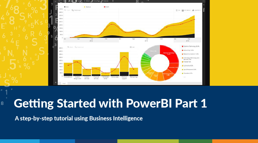
The aim of this blog is to get you started on creating your first BI dashboard using simple ABS data in Power BI. Power BI can provide quick insights and is a basic form of augmented data discovery. I am not necessarily advocating you run out to buy the software—the reason I’ve chosen it as a starter is that most businesses have Microsoft Office and will already have access to the software. In addition, each year Gartner publishes a magic quadrant and for 2019 Power BI is ranked clearly ahead of the other Business Intelligence (BI) platforms.
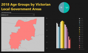
We are going create the following dashboard:
You will need:
- Power BI Desktop installed on your computer or laptop (I am currently running version: 2.67.5404.581 64-bit (March 2019)).
- Access to Microsoft Excel
- This zip file which contains all the assets you’ll need
Let’s get started!
From a pivoted version of the Australian Bureau of Statistics (ABS) age group data, extract below.
| LGA code | LGA Official Name | LGA name | 0 to 04 | 05 to 09 | 10 to 14 | 15 to 19 |
|---|---|---|---|---|---|---|
| 20110 | ALPINE SHIRE | Alpine (S) | 553 | 733 | 774 | 683 |
| 20260 | ARARAT RURAL CITY | Ararat (RC) | 602 | 647 | 660 | 598 |
| 20570 | BALLARAT CITY | Ballarat (C) | 7038 | 7053 | 6497 | 6769 |
| 20660 | BANYULE CITY | Banyule (C) | 8448 | 8138 | 7221 | 7095 |
| 20740 | BASS COAST SHIRE | Bass Coast (S) | 1879 | 2065 | 1889 | 1741 |
| 20830 | BAW BAW SHIRE | Baw Baw (S) | 3294 | 3539 | 3167 | 3143 |
| 20910 | BAYSIDE CITY | Bayside (C) | 5461 | 6940 | 7147 | 6607 |
| 21010 | BENALLA RURAL CITY | Benalla (RC) | 728 | 736 | 778 | 806 |
Load the data
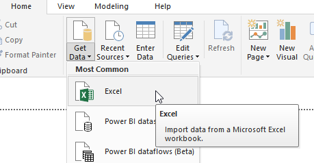
- After opening up Power BI Desktop with a blank project, on the home tab click on Get Data, select Excel and navigate to your data file.
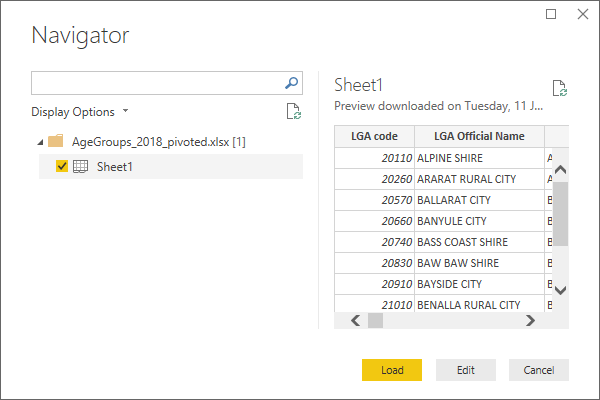
- The Navigator pop-up will appear, select option Sheet1 and load the data.
Prepare the data
You will need to do some very minor pre-processing of the data prior to creating visuals.
- Open the modelling tab.
- On the right of your screen, your data should have been added to the “Fields” tray. Click on “LGA Official Name” field.
- On the modelling ribbon, under Properties > Data category, select “Place”.
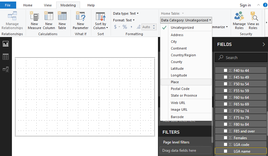

- Notice that there is now a globe in front of the “LGA Official Name” field, this indicates to the program that this field contains information about a place on earth, i.e. this is our “join” column.
- The mapping visualisation we are going to use takes data in the TopoJSON format, so our next step is to create a TopoJSON for the Local Government Areas (LGAs). We will not go through this in detail here, but LGAs can be downloaded from vic.gov.au as a .SHP file, which can then be converted into TopoJSON using https://mapshaper.org/
Set up the page layout
- Return to the Home tab.
- On the right-hand side you’ll notice a panel titled VISUALIZATIONS, click on the roller brush
 and expand the Wallpaper drop-down menu. Choose a colour—I have chosen “Black 10% Lighter”.
 - Click on the
 tool on the Home ribbon menu and a text box will be automatically created on your dashboard. We’ll put our title text here.
- Give your page a heading, I have chosen: “2018 Age Groups by Victorian Local Government Areas” with font Segoe (Bold), size 44, coloured yellow.
Creating the visuals
SHAPE MAP
The first visual we are going to make is using the Shape map function. You can find this function on the Visualisation panel and the icon looks like this: ![]() If it’s unavailable, go to File > Options and Settings > Options > Preview Features, then select the Shape Map Visual checkbox. Click “OK”, and restart Power BI Desktop if needed.
If it’s unavailable, go to File > Options and Settings > Options > Preview Features, then select the Shape Map Visual checkbox. Click “OK”, and restart Power BI Desktop if needed.
-
- Click the Shape Map icon, and it will be added to your dashboard. Don’t worry about getting it in the rights spot yet, we can tweak it later.
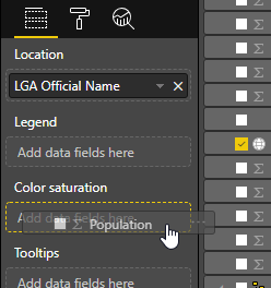
- Drag the “LGA Official Name” field into “Location”.
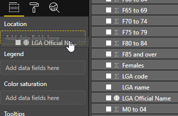
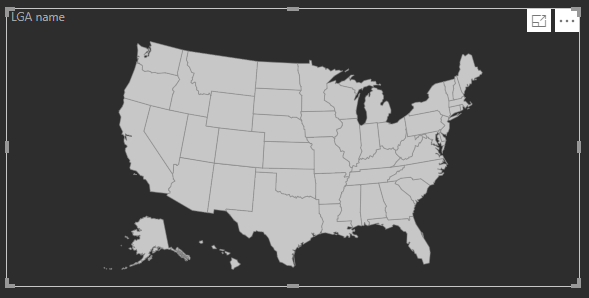
- Power BI will populate the map with US states by default, and of course none of the Victorian LGA names will join successfully.
- We need to load in our LGA geometries: switch to the “Format” tab, open the “Shape” drop-down menu, and click the “Add Map” button
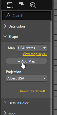
- Navigate to your TopoJSON file and open it—after a moment the map should populate with the LGAs of Victoria.
- Now we are going to style it into a thematic map, based on LGA population.
- Drag the Population column into “Color saturation”.
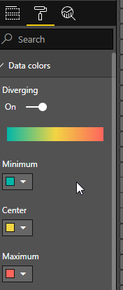
- Your map should style up automatically based on the values in the Population column. To style the colour ramp as you like, head to the Format tab and open the “Data colors” drop-down menu.
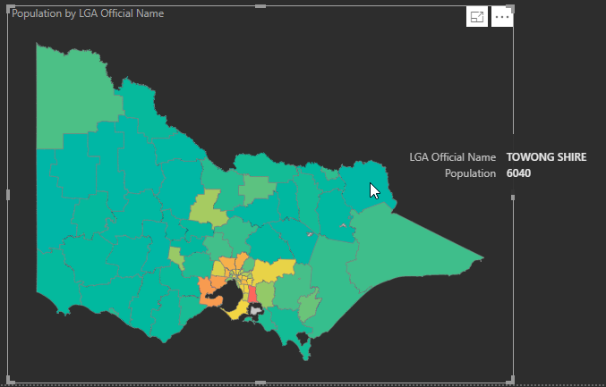
- Your data should now be styled into a thematic map based on population, and will automatically have included pop-up windows with the LGA name and Population count.
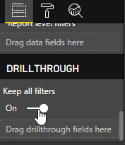
- The final step to complete the map is to enable the drillthrough function, by navigating to the bottom of the “Fields” menu to the “Drillthrough” tab, and flicking “Keep all filters” to on.
- Your map is complete!
SLICER
Next, we are going to add a “Slicer” ![]() visualisation. This will allow us to select LGAs by name from a drop-down menu to filter our dashboard on-the-fly. It will act as our primary “drillthrough” control.
visualisation. This will allow us to select LGAs by name from a drop-down menu to filter our dashboard on-the-fly. It will act as our primary “drillthrough” control.
- Click on the Slicer icon under the visualisations menu.
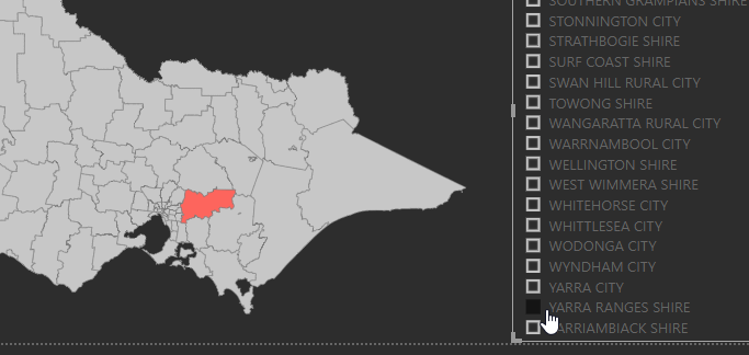
- We want to populate this list with our LGA names, so drag the “LGA Name Official” column the slicer “Field”
- Test out the slicer: you should be able to select individual LGA names directly out of your list and have the map update instantly.
- Lastly, we are going to change this to a drop-down menu to save some room. To do this, make sure your Slicer element is selected, and there should a tiny arrow in the top right corner, underneath the three-dot menu. Click this and select “Dropdown”.
- While you’re at it, go ahead and tweak the styling on your Slicer, you will need to adjust some colours to see what you are doing!
That’s a wrap on part 1 of the Getting Started with Power BI series. Click here for part 2 in which we add in our charts to complete our dashboard.
Tom completed a Master’s degree in Geospatial Information at RMIT in 2015 and has worked on various web-based mapping projects on a freelance basis until he came to Spatial Vision.
- GeoNetwork and Spatial Metadata Cataloguing - March 3, 2020
- Getting Started with Power BI Part 2 - July 12, 2019
- Getting Started with Power BI Part 1 - July 4, 2019