There has never been such a rich array of free platforms to visualise and share data stories. Previously, we brought you ‘7 of the Best Data Visualisation Platforms’. Now in 2020 we thought it would be timely to revisit some of the Best Simple Visualisation Platforms and focus on those that can now handle geospatial data and are free and easy to use. Our previous platform list contained some standout platforms however not all are now free. In addition, many now have geospatial capabilities.
This review ranks the following 8 visualisation tools using 5 primary criteria: Spatial Capabilities, Interactivity, Simplicity, Customisability and Privacy (refer to criteria definitions at bottom of page).
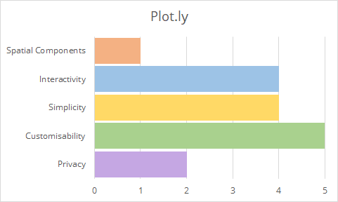
1. Plotly
Create interactive d3 charts for your website. This is one of the simplest tools available to create interactive charts. Using an Excel-like spreadsheet interface, data can be imported or copy & pasted into a table to create a chart. Equally, you can link to a SQL database and filter/manipulate your data if you desire before publishing. There are many chart styles available to choose from with the ability to create and publish dashboards. The data and chart creation can be a bit fiddly at times, however.
5 CRITERIA RANKING: PLOTLY
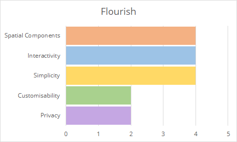
2. Flourish
Like Plot.ly, Flourish allows you to upload spreadsheets or paste from Excel which you can turn into charts, maps and interactive stories. It is extremely straightforward with no coding required and they have a very flexible template library. Once you’ve finished your visualization you can embed it on your own site or download the RAW files.
5 CRITERIA RANKING: FLOURISH
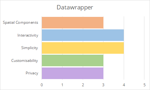
Datawrapper is built by journalists, for journalists and is billed as a storytelling tool. You can create interactive and responsive data visualizations without any code or design skills. This is a great tool for people looking to create their own data visualisations with limited time.

5 CRITERIA RANKING: DATAWRAPPER
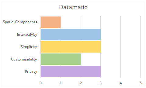
4. Datamatic
Another d3-based visualisation tool, Datamatic will look very familiar to those familiar with the Google Drive series such as Sheets and Docs. And for good reason. This tool is backed by Google as part of the Digital News Initiative. However it is relatively simplistic and sometimes not as great to display some information like lines and polygons.

5 CRITERIA RANKING: DATAMATIC
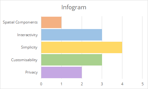
5. Infogram
Infogram is a web-based visualisation platform which offers interactive charts, graphics and maps to tell a story. There is a free version of Infogram available, however it does force the visualisation to appear publicly unless the account is upgraded to a paid version. That said, it still has an engaging user experience with animations and interactivity.
5 CRITERIA RANKING: INFOGRAM
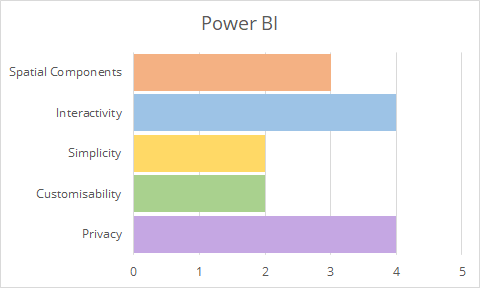
6. Power BI
Power BI is a free dashboard based platform. It has some basic mapping capabilities and even a rudimentary geocoder. It supports Topojson formats and not typical native geojson (however this can be converted with online sites such as Mapshaper.com). It is quite reactive with data, allowing the selection and filtering of information. However it is still relatively simplistic in its free form with no coding capability. It is useful to see that data uploaded can be hosted within Australia for privacy reasons.
5 CRITERIA RANKING: POWER BI
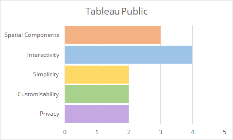
7. Tableau Public
Tableau Public is a free version of the well-known analytics platform Tableau. This free version carries the typical forced public data requirement of many premium analytic products. It does have the capabilities to plot spatial data from tables, but exporting the data requires an account. Whilst is can do a lot of table-based work, it can be fiddly to try and get maps working well.
5 CRITERIA RANKING: TABLEAU
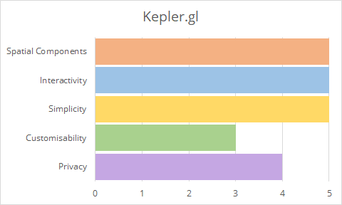
8. Kepler.gl
Kepler.gl is a web-based visualisation tool developed by the popular ride share company Uber in conjunction with Mapbox. It is a completely free and open source platform which consumes csv and geojson formats (including geometry collections!). It not only allows the plotting of data in 2d but also in 3d and in temporal formats.
5 CRITERIA RANKING: KEPLER.GL
In summary…
Best overall: Kepler.gl
For a more detailed comparison of each platform against these criteria, click here and here.
For ranking criteria definitions, see below table.
| Spatial Capabilities | Interactivity | Simplicity | Customisability | Privacy |
| - Points - Lines - Polygons - 3D data - Temporal data | - Ability to identify features - Zoomable maps - Reactive data (that changes as you explore it) - Customisable basemap - Able to be embedded in websites | - Web based - Simple User Interface - Easy to setup and start using - Drag and Drop data - Intelligent Data Recognition (Can reasonably predict the fields) | - Customisable Charts to support maps - Data feeds (for example SQL servers, URLs etc) - Data Editable in platform - Codable features - Open Source | - Non-Public output for free use - Browser Side data Loading - Login Required - SSH Secured - Hosted Inside Australia |
We hope you enjoyed this. Please feel free to share some of your visualisation work using these platforms over on our Facebook page.
For assistance with your data visualisation needs, please contact us.
Disclaimer: Spatial Vision is not affiliated with any of the data visualisation software mentioned.
- Case Study: GIS Service Plan - July 24, 2024
- Climate Change Statement - November 9, 2021
- Welcome Ryanne Firme – Digital Cadastre Modernisation Team - May 21, 2021