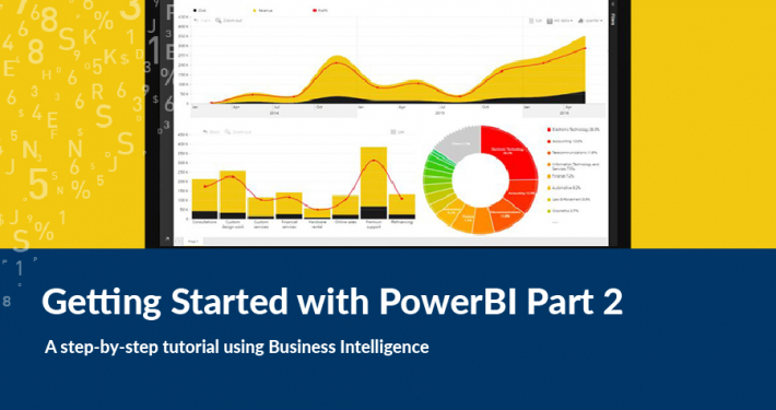
Welcome to part 2 of the Getting Started with Power BI series, where we show you how to transform data into powerful visualisations.
If you missed part 1, you can find it here. This tutorial continues on from the Slicer visualisation addition in Part 1.
Part 2
CHARTS
The final elements we are going to add now are some graphical data visualisations in the form of charts. These charts will allow us to analyse some different aspects of the data whilst staying synchronised with the Slicer and Shape map.
First, we will add a Clustered column chart. On it we will show the different age group ranges from our data for an individual LGA.
- Under Visualisations, select the Clustered column chart element
 to add one to your dashboard.
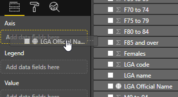
 - To add our data, we want our LGA names on the X-axis, so we drag our “LGA Official Name” field into “Axis”
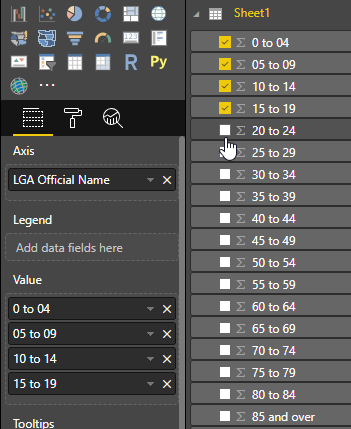
- On the Y-axis, we want to display our gender-aggregated age ranges. Clicking the tick-box next to a field will automatically add it to the “Values” section, so go ahead and add all the ranges from “0 to 04” all the way down to “85 and over”.
- Once you have done this, the chart is going to look very busy and not telling us much.
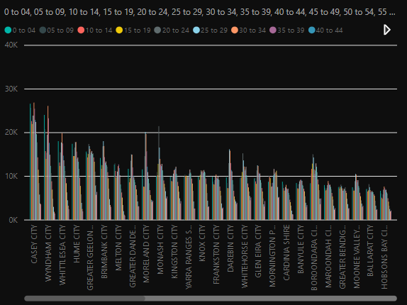
- For this example, we want to show just one LGA name at a time, rather than all 300+ in Victoria. To do this we need to change the “Minimum category width” setting for the chart, under Format > X-Axis. Put it all the way up to 180 and, depending on the width of your chart, you should see one or two LGA’s data. Shrink the chart a bit to get it down to one LGA’s worth of data.
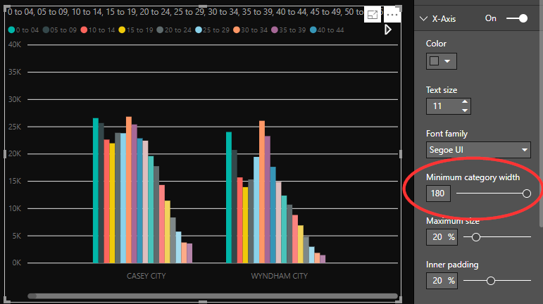
- Go ahead and play around with your chart format to get it looking how you want—I have changed the Legend to appear on the right and turned off the “Title” setting.
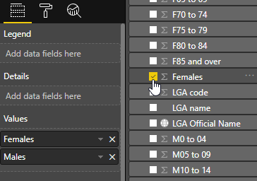
The final element we are going to add to this dashboard is a classic “Pie chart”. On this chart we are going to show the aggregated population split between women and men. This means that the chart will update based on ALL of the data currently filtered on our dashboard, i.e. if we have no specific LGA selected, then it will show the summarised population for the state, and if we select an LGA it will show the population just for that LGA.
-
- Add a Pie chart element from the Visualisations menu

- Because we are aggregating our data, we do not need a Legend field for this chart. Instead just add the Females and Males fields directly to “Values” by clicking the checkboxes next to them.
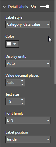
- That is it. Our chart is ready to use. The only tweaks left are to style it how we like—I have turned off the title and modified the “Detail labels” to show “Category, data value” inside the chart area.
- Add a Pie chart element from the Visualisations menu
That’s a wrap on the Getting Started with Power BI series. If you enjoyed this blog, check out our other posts below.
Tom completed a Master’s degree in Geospatial Information at RMIT in 2015 and has worked on various web-based mapping projects on a freelance basis until he came to Spatial Vision.
- GeoNetwork and Spatial Metadata Cataloguing - March 3, 2020
- Getting Started with Power BI Part 2 - July 12, 2019
- Getting Started with Power BI Part 1 - July 4, 2019