by Craig Molyneux
When we use the term ‘data visualisation’ it conjures up an image of charts, maps and dashboards, but it’s far more complex than this. Over the last few years, there has been steady development of cloud-hosted applications that are becoming increasingly affordable and accessible, with many built on open-source frameworks.
High end products like Qlik, Tableau, Yellowfin and PowerBI cater to sophisticated user requirements with large databases, such as finance or health. However, if your needs are not as sophisticated and your costs limited, there are other applications available that may serve your purpose.
This list (in no particular order) is just my personal preference of tools that may help you. In general, they’re easy to use, provide aesthetically pleasing results, are secure, and are easy to share and integrate.
1. Plotly
Create interactive d3 charts for your website. This is one of the simplest tools available to create interactive charts. Using an Excel-like spreadsheet interface, data can be imported or copy & pasted into a table to create a chart. Equally you can link to a SQL database and filter/manipulate your data if you desire before publishing. There are many chart styles available to choose from with the ability to create and publish dashboards.
2. Flourish
Like Plotly, Flourish allows you to upload spreadsheets or paste from Excel which you can turn into charts, maps and interactive stories. It is extremely straightforward, no coding required and they have a very flexible template library. Once you’ve finished your visualization you can embed it on your own site or download the RAW files.

4. Datawrapper
Datawrapper is built by journalists, for journalists and is billed as a storytelling tool. You can create interactive and responsive data visualizations without any code or design skills. This is a great tool for people looking to create their own data visualisations with limited time

5. Datamatic
Another d3 based visualisation tool, Datamatic will look very familiar to those familiar with the Google Drive series such as Sheets and Docs. And for good reason. This tool is backed by Google as part of the Digital News Initiative.


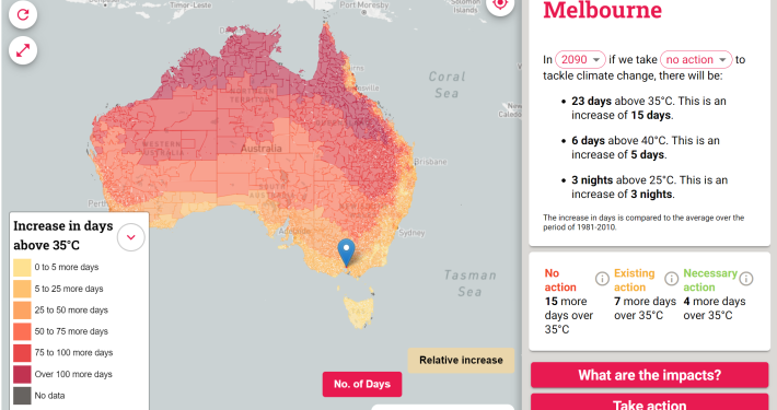
6. Carto
Location, location, location. CARTO offers you the ability to “unlock the potential of your location data” and their platform is much more than just data visualisation. You can create a custom analytics dashboard with clean and detailed map visualisations, import data quickly and easily in a range of formats, and discover and predict key insights from location data. CARTO is an extremely powerful platform with a host of extra features, businesses look no further!
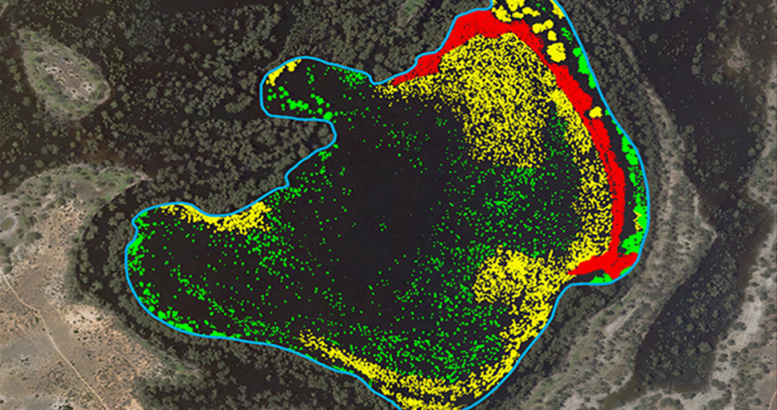
7. GIS Cloud
GIS Cloud knows maps. Their platform spruiks real-time, collaborative mapping for entire organisations. While it doesn’t allow for standard data visualisations, it does allow you to collect or upload your own data, visualise it on a map with multiple layers and a high level of detail, and share it with your team.
For assistance with your data visualisation needs, please contact us
- Case Study: GIS Service Plan - July 24, 2024
- Climate Change Statement - November 9, 2021
- Welcome Ryanne Firme – Digital Cadastre Modernisation Team - May 21, 2021