Creating a good map is essential when it comes to getting an important message across to an intended audience, but have you ever thought that the conclusions you draw from the information on the map could be unintentionally biased? Maps are not only key tools for spatially displaying trends in data and changes over time; they can also be quite influential in how you interpret the information, depending on what message the creator wants to portray.
Mapping Change Over Time
Some of the most interesting maps are those which show extreme changes in a particular area over a given time. One such example of this surrounds the visualisation of Australian Bureau of Statistics (ABS) Census data. There are many depictions of how population, housing affordability and household family composition has changed over the years. Granted, this data can be shown as simple statistics in a table, but where the real power lies is in visualising this data spatially. By showing change over time through a map, the user can start to make observations, and perhaps, draw conclusions from what the data is showing us. Like all scenarios, generally, you will have a high proportion of data which sits in the average/median grouping where some change might have occurred, but then you will also generally observe some outliers which are “extremes” from the median. That’s why it’s always a good idea to always normalise your data in order to show variances from the total.
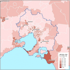
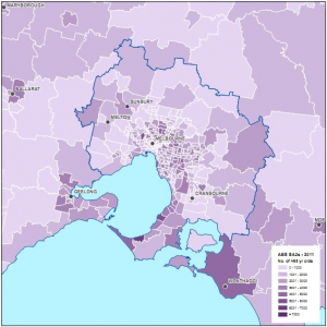
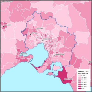
Using the ABS data, one could make a map showing snapshots of raw (total) values. For example, we could have a look at the distribution of Melbourne’s aging population (65 yrs and older) over the last three census years (2006, 2011 and 2016) as shown below:
Showing Percentage Change
This is just one of the many ways you can visualise this data, and to be honest, it doesn’t really do the data justice to purely represent total values. A much more effective way is by performing a normalisation on the data; to show the percentage change in statistics over time for a given area. This may then paint a better picture of how an area is changing in terms of demographics, infrastructure, housing affordability, etc. For example, instead of looking at the total number of people living in a given area who belong to a given age group, let’s see at how that would look in terms of a percentage change in the number of people who fall into this age category over the last 2 census years (2011 and 2016) as shown below:
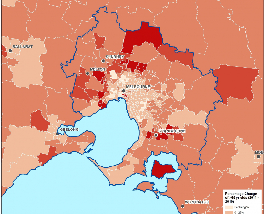
But what is even more interesting is how we could go about displaying the data and altering the symbology ranges to paint a totally different story. For example, we could choose a set of ranges which really accentuate the aging population by skewing the ranges closer to 0 in order to make the situation look more extreme, such as the maps shown below:
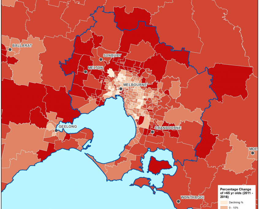
Or, we could show the data at the other end of the scale as having only a moderate amount of change, as shown below: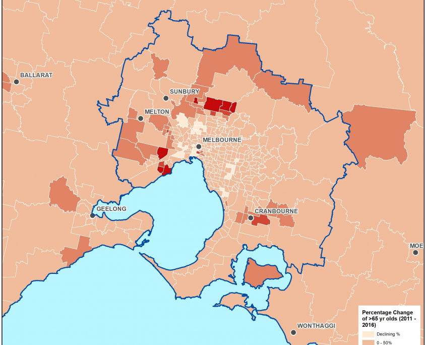
Telling A Story
As you can see, we are showing the same data on each map, but depending on the story we want to convey, we can use different symbology ranges to alter that message. Without seeing the raw data, it can be hard at times for the user to see the overall picture of what’s actually happening, particularly when, as humans, we are easily swayed by visual indicators. It is therefore the responsibility of the map maker to choose appropriate symbology so that the most unbiased view of the data can be achieved.
But as we know, a story is much more interesting if we can show that something “extreme” or “exciting” is happening. So the ultimate take home message is to understand that data is data, it’s how we interpret data, particularly through maps, that comes down to the user’s perception of the information being shown.
- Case Study: GIS Service Plan - July 24, 2024
- Climate Change Statement - November 9, 2021
- Welcome Ryanne Firme – Digital Cadastre Modernisation Team - May 21, 2021