As someone working in both the spatial analysis industry as well as software development, I am impressed when coming across tools that can be used for company to analyse performance. Having spent time with fully fledged GIS software and also having an understanding of the statistics useful for analysing the production of a business from my software testing background I was immediately drawn to the capabilities that lie behind ESRIs operation dashboard.
Features That Shine
The most impressive aspect of the tool I found to be was its ability to link displays with charts, figures and legends and adjust them accordingly. The user is able to set these elements to display the values depending on what features are shown in the current map extent or vice versa where they can select a value from a graph and have the map only display the specified value. This interactivity was something that felt intuitive. Overall, the chart options are limited, but give enough variety to the end user to enable them to produce their final output. An example of great use of the graphs is this dashboard which analyzed the population demographics in Belize.
The bar chart showcases the ability to hover over each bar to reveal an accurate statistic, it also allows for easy comparison between separate regions as any bar chart should but also the ability to deselect each year and only display the values for a chosen year or multiple years for easier comparison between areas for 2014 for example. Although the options are there to generate a useable output the limited options prevent the user from having an eye catching design.
Multiple Maps
A common issue with the masses of data that are commonly associated with spatial data is that maps often become cluttered with data. ESRIs successful attempt to reduce this and allow users to create a proper story is the ability to add multiple maps. Rather than having users display all their data on the one map you can add a second map to the dashboard or have them tabulated in a similar for to Microsoft Excel sheets. Furthermore, when displaying multiple maps the options available allow them to configure each one to link their extents to one another and or update other elements as well to allow a graph to only display the figures for what data is shown in the current extent. Its with this sort of linking that I found the tool to really shine and set itself apart from other data visualization tools both in its sense of uniqueness as well as its simplicity to set it up. It feels eerily similar to a lot of the drag and drop options that have become almost a norm in the online web app area. In comparison, desktop based applications such as Arcmap require you to go through the data frame properties in order to link the different views which can become a bit of a process for those without a lot of experience in the spatial analysis area. The capability allows users to display two different data sets that are the same feature type such as two point layers.
Live Data and Analysis Capability
The dashboard also responds well to time aware data allowing users to display data that correspond to a selected period or incorporate live data. When using live data each widget has the option to refresh/update as a chosen time interval to adjust to any new features added to the underlying data. More than just widgets, the dashboard allows you to stream in data to show movement of what is being tracked such as vehicles, animals or display the current weather.
My main gripe with the dashboard is its limited analysis capability, which made editing the data very tedious. Needing to change even the simple aspects of the map aspects such as symbolisation requires you to go back to the map on ArcGIS online and adjust it accordingly. What should have been an effortless alteration in the colour of my point symbols become an ordeal, having to go back to ArcGIS online, change the colour, come back to my dashboard only to realise I hadn’t matched the point colour with my chart colours.
Shown below is a sample output of some basic mock up data that I created using ESRI’s 123survey which is a tool that allows you to create an online survey and specify locations that may refer to where the survey was taken or point out a location of an observation. I fed the survey results into ArcGIS online and then created a dashboard based upon that data. The survey asked for a location and a colour response (Red, Green or Blue) and then plotted the results.
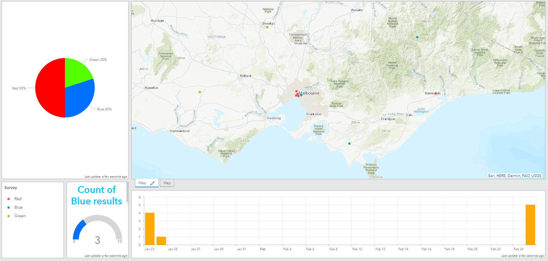

Adding a pie chart to show the percentage of colours chosen, a gauge to indicate the amount of ‘blue’ results out of the total responses and a bar chart to indicate the days in which responses were logged. The charts correlate well when working with performance indicators, you can set the gauge to change colour when a specified percentage or total amount is reached for a value such as if a company wanted to maintain a high customer satisfaction rate the gauge could turn red if more than 10% of survey correspondents logged a satisfaction rating.
In its entirety, I can see where the Dashboard can be used in the data visualisation area, it is definitely best suited when working with live data. The simplicity of its features allows for almost anyone to create a useable output, importing data into ArcGIS online is already a breeze and to create a dashboard is only a couple of extra steps. The true skills lie with sourcing the data and being able to create the initial map in other software. Despite lacking the ability to create custom widgets (which would allow this product to really shine and allow the more experienced users to showcase more than just storytelling abilities) and creating some tedious workflows, its seamless integration with ESRIs other products is something that many users would be able to benefit from given their dominance in the market.
For further information, please contact Spatial Vision at info@spatialvision.com.au
- Getting the most out of your GIS strategy & investment - July 24, 2024
- Climate Change & Homelessness: Understanding the Connection - July 24, 2024
- Navigating the complexity of geoscience data analysis - July 24, 2024