Kepler allows users to easily present their data in a few simple clicks and can produce more advanced looking representations for those willing to use other software. During my time with Kepler I became aware of the stark difference between a data visualisation tool and a fully fledged GIS software platform.
Having not spent previous time with a simple data visualisation tool, I quickly became frustrated with Kepler but was eventually relieved when I realised that its intended use was not for spatial analysis, but simply to allow a user to display their data.

The tool allows users to upload csv, json and geojson files and then given the files contain the right fields, can be displayed in a matter of seconds. Kepler then allows for some analysis to be done in order for it to generate cluster values to create a heat map, or similar type visualisations. I found this feature to be really intuitive. An efficient way to display multiple pieces of information was the ability to specify, via a colour ramp, one attribute and then specify a height to that point for another value (such as point clusters).
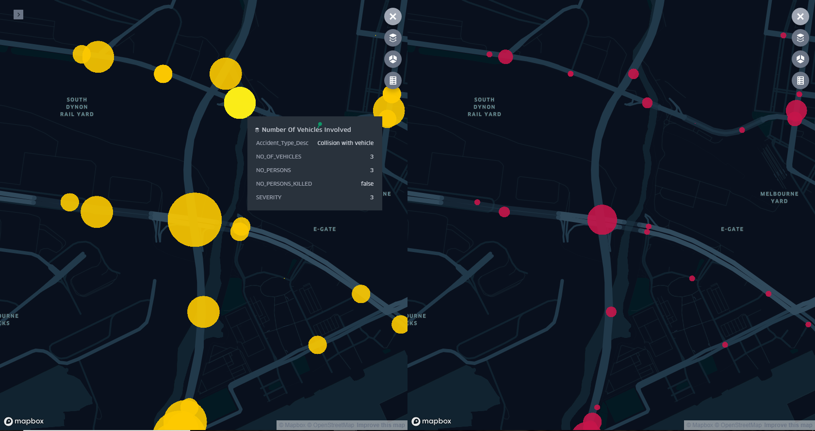
Another useful tool that Kepler provides is the ability to have dual data views which allows for some really good comparative maps, however I feel that some more options when it comes to customisation would be good. Another flaw I discovered was the popup tool displays a popup, only on the view that is clicked. I think that having it display on both views would allow for greater comparison, especially where points may overlap.
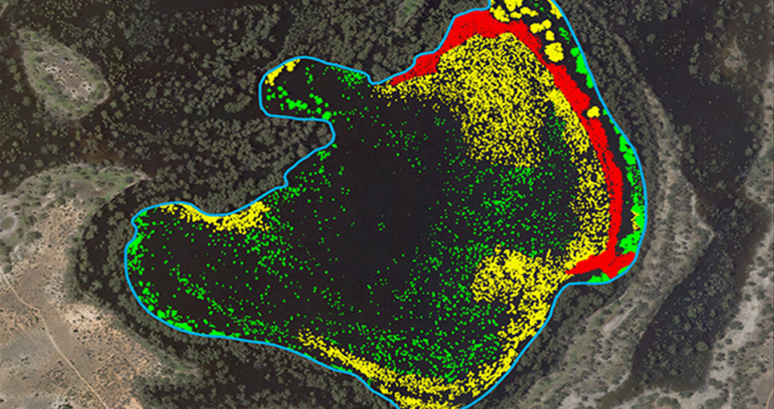
Adding and playing with polygons is very similar to csvs, as long as your data is in a geojson format. You have similar options to colouring and applying elevations.

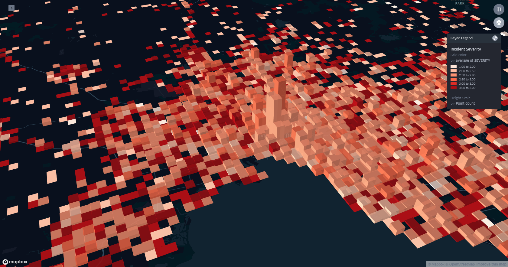
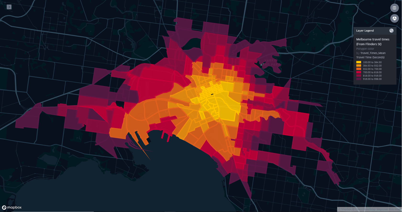
One final tool I found useful was Kepler’s ability to implement a base map that you can create in MapBox. I used one of their default styles which allowed me to have a satellite image as the base map to my visualisation. However, you could create your own style to compliment the data being portrayed.

Overall, the tool is useful for both beginner and intermediate users as it incorporates data produced from other software quite well. The limited options when it come to the file types when uploading the data become a bit frustrating however given that it’s in the correct format with all the necessary fields the tool is very intuitive and enables users to create stunning visualisations.
For more information about our data visualisation services, please Contact Us
- Getting the most out of your GIS strategy & investment - July 24, 2024
- Climate Change & Homelessness: Understanding the Connection - July 24, 2024
- Navigating the complexity of geoscience data analysis - July 24, 2024